Introduction
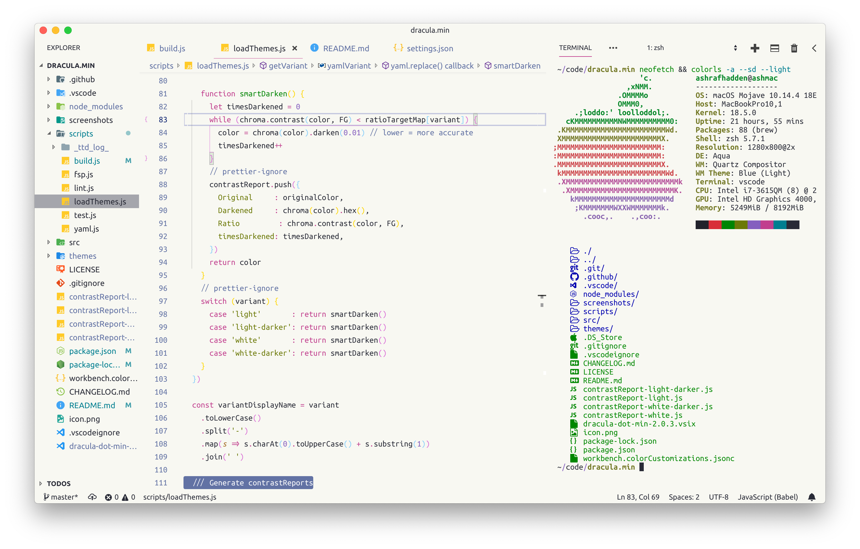
Code highlighting is usually treated as highlighting as many things as possible. For example:

This is darkula-light, but colorschemes are all the same for the sake of the argument. There is A LOT happening on the image, everything is of the different color and as a result nothing is really highlighted. Well, the apple logo draws the attention the most, is that the expected result?
This post is about to offer a colorscheme where things that require attention are highlighted, and other are not.
What to highlight in code
I love the expression “from the first principles”, but find it too pretentious. Let’s just outline what we want to highlight.
Things I explicitly asked to highlight. Search terms mainly. Would be strange not to highlight them.
Comments. People hopefully wrote comments because code was not expressive enough about why something is done whe way it’s done. This could also motivate to remove commented code, follow linter rules and write only comments that are needed.
Linter errors. If a linter thinks the code is wrong you better fix it sooner than later. So let’s give it an instrument to annoy you.
Git diff. diffr got this right.
Pair of the bracket or quote under cursor. Counting brackets is a programmers’ hobby, let’s suck the last joy from their lives. I’m kidding, it’s really useful.
This is it. I can’t find a reason why keywords, constants or anything else should draw my attention. Fight me.
What to highlight outside of the code
There is an excellent review of a book The Design of Everyday Things. Design is hard but it’s not a total black magic. It can be decomposed and there is a number of things to look at when designing things.
I’m not Don Norman and generally pretty lame at this so don’t trust me on the concrete examples. Having said that,
- Make interface minimal. You don’t need current path, sidebar, second sidebar and a terminal open at the same time. Stick to the code itself.
- Make it clear where one piece ends and another piece starts. There is no border between different buffers, panels and basically anything on the first picture of this post, and this is confusing.
- Allow code folding. Turn it off by default though. It is useful in very niche use cases like checking tests by headings, mostly you want to read code from top to bottom or jump through definitions.
The main goal of these suggestions is that code editor should not disturb you reading code.
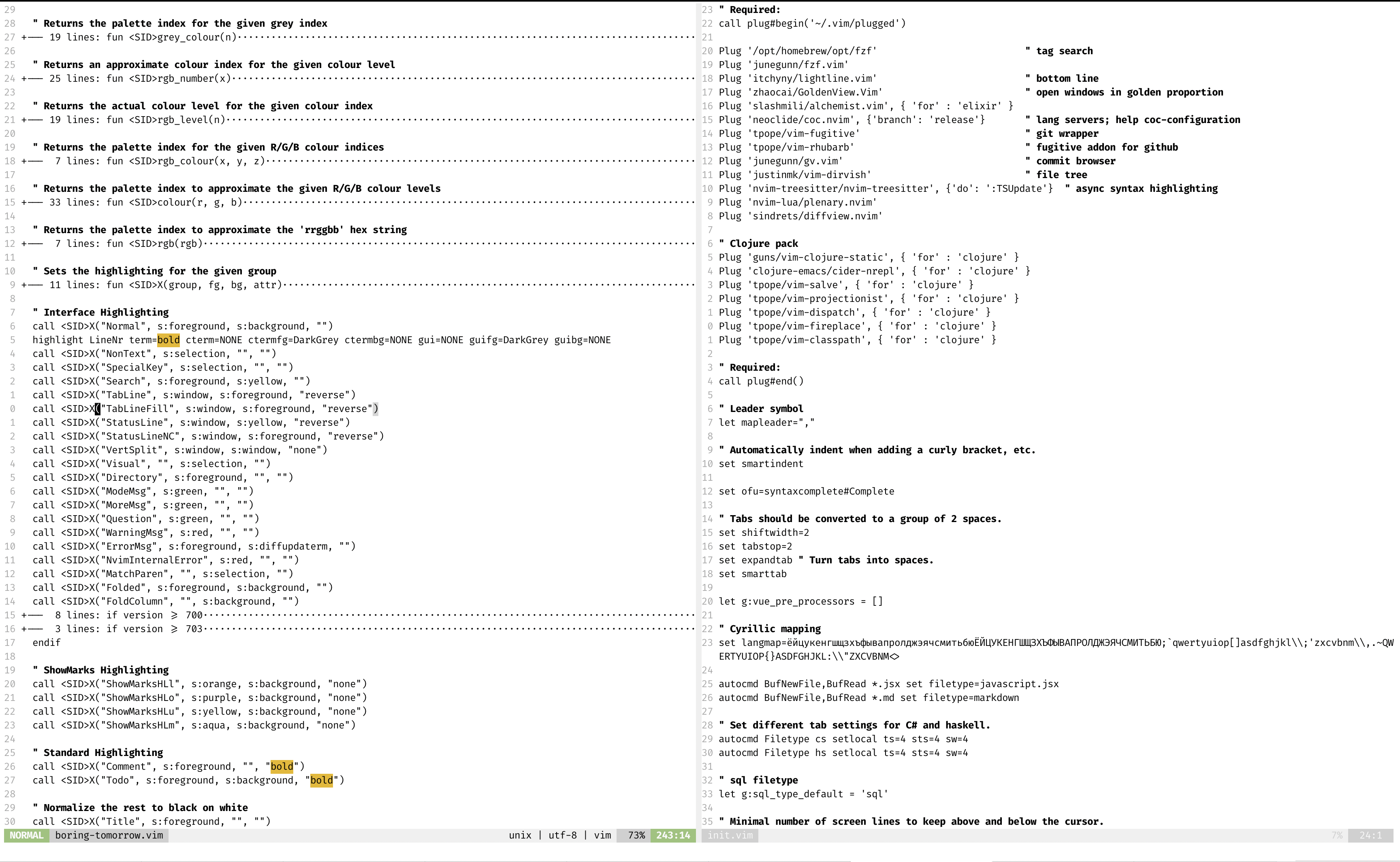
Pics
 This blog post expressed as a colorscheme

Conclusion
Don’t highlight everything at once, this kills the idea of it. Most of the highlighthing should be temporary.
Here is a link at my attempt on highlighting for (neo)vim.