This post is a rationalisation of “I don’t like cards”. I say that in most cases where cards are used, they don’t need to be used. Specifically, they take space, they let you skip gestalt principles and be lazy and undisciplined, and being so easy to implement they are often used by developers. To multiply the effect, you can put a card into a card, and it seems so hard not to do so.
We recognise patterns. This is known for quite some time, specifically Wertheimer in 1923 wrote the paper that everyone cites, where he said just that, and additionally suggested a number of laws of how patterns are recognised. The paper is called Laws of Organization in Perceptual Forms.
Dejan Todorović wrote an article named Gestalt Principles where he retold this work and added more principles that were proposed later.
Principles that we’ll use here are the proximity principle and the principle of common region.
TL;DR: Cards got overused. Often you can achieve better results by applying the proximity principle instead. The principle is, recursively, objects that are closer to each other than to other objects are perceived as a whole.
grug version: grug read gestalt principles. grug make internal spacing less than external spacing, applies proximity principle. proximity enough, no need for cards.
Spacing: Proximity Principle
Traditionally, proximity principle is put the following way: elements tend to be perceived as aggregated into groups if they are near each other. Usually this comes with the term Negative Space, which is basically gap between content.
I find the following phrasing more helpful: Recursively, internal spacing should be no larger than external spacing. Example:

Sidenote: in CSS there are at least gap, margin and padding properties to set spacing. Please don’t emulate one with another without a good reason. There is a more radical take on it that says margin considered harmful.
Cards: Common Region Principle
The definition goes like: elements tend to be grouped together if they are located within the same closed region.
Basically, in our brains cards have preference over spacing. Example:

That’s too convenient. I mean yes, you can make everything of cards, but there are other principles, and there is a cards tax in space and cognitive burden. So.
What’s wrong with cards
Cards take space
Each card needs padding, there should still be a gap between cards. You can ignore it but sometimes it’s the difference between scroll and no scroll. Example:
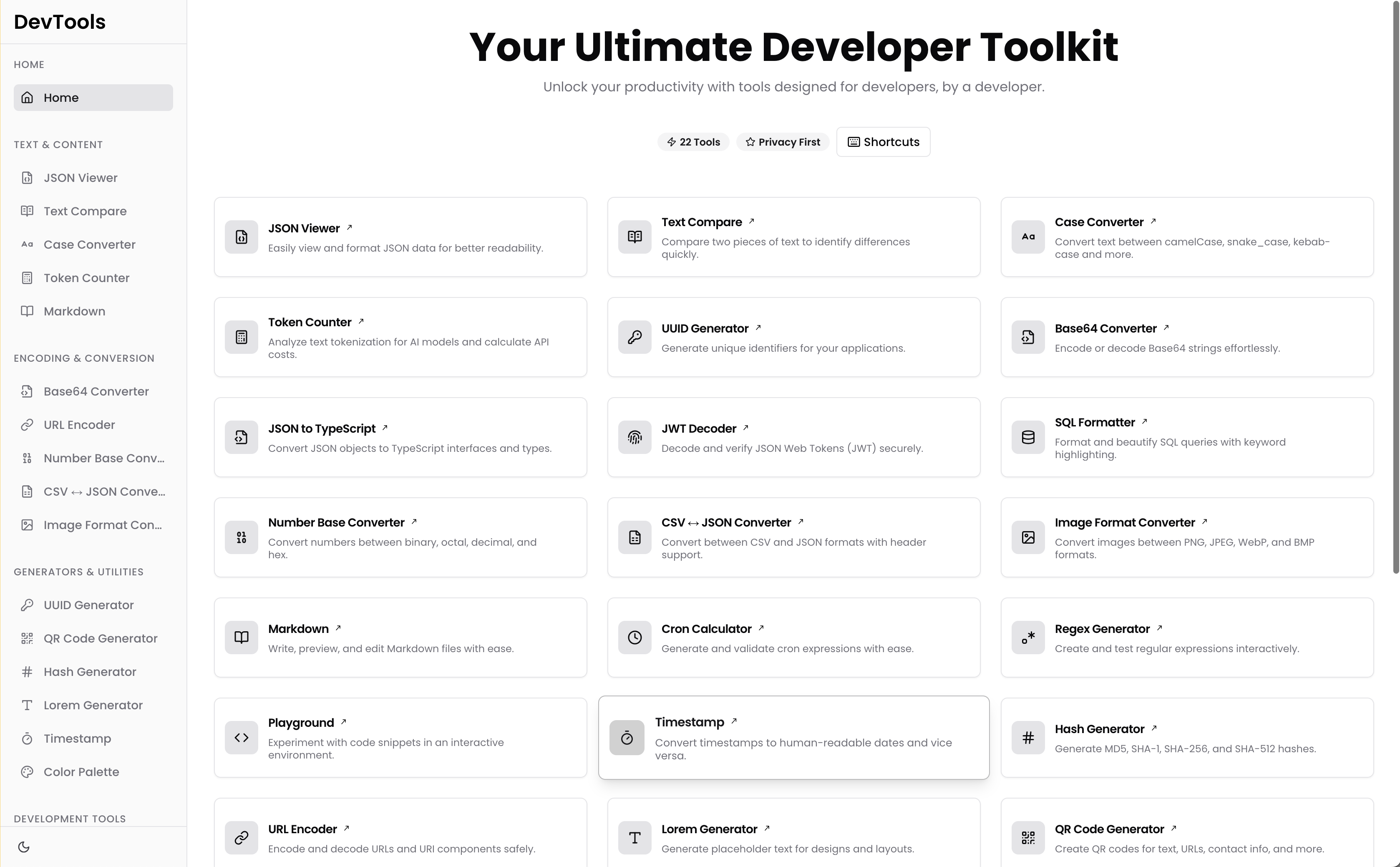
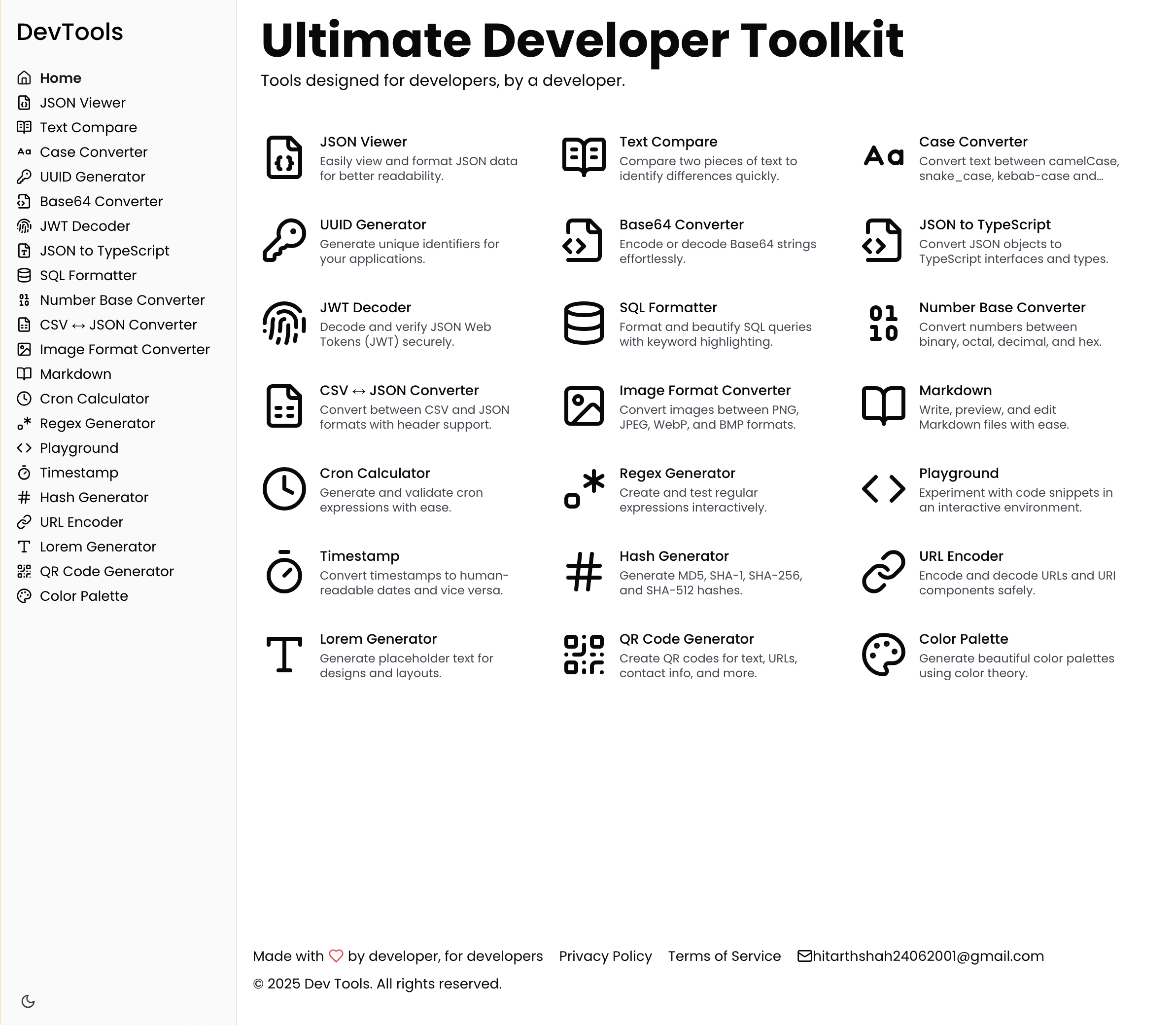
Not only the scroll disappeared, but icons became way more visible and distinguishable from each other.
Sidenote: I’ll send this as a suggestion to the dev-tool.dev developer.
Cards conceal that you don’t have anything to say
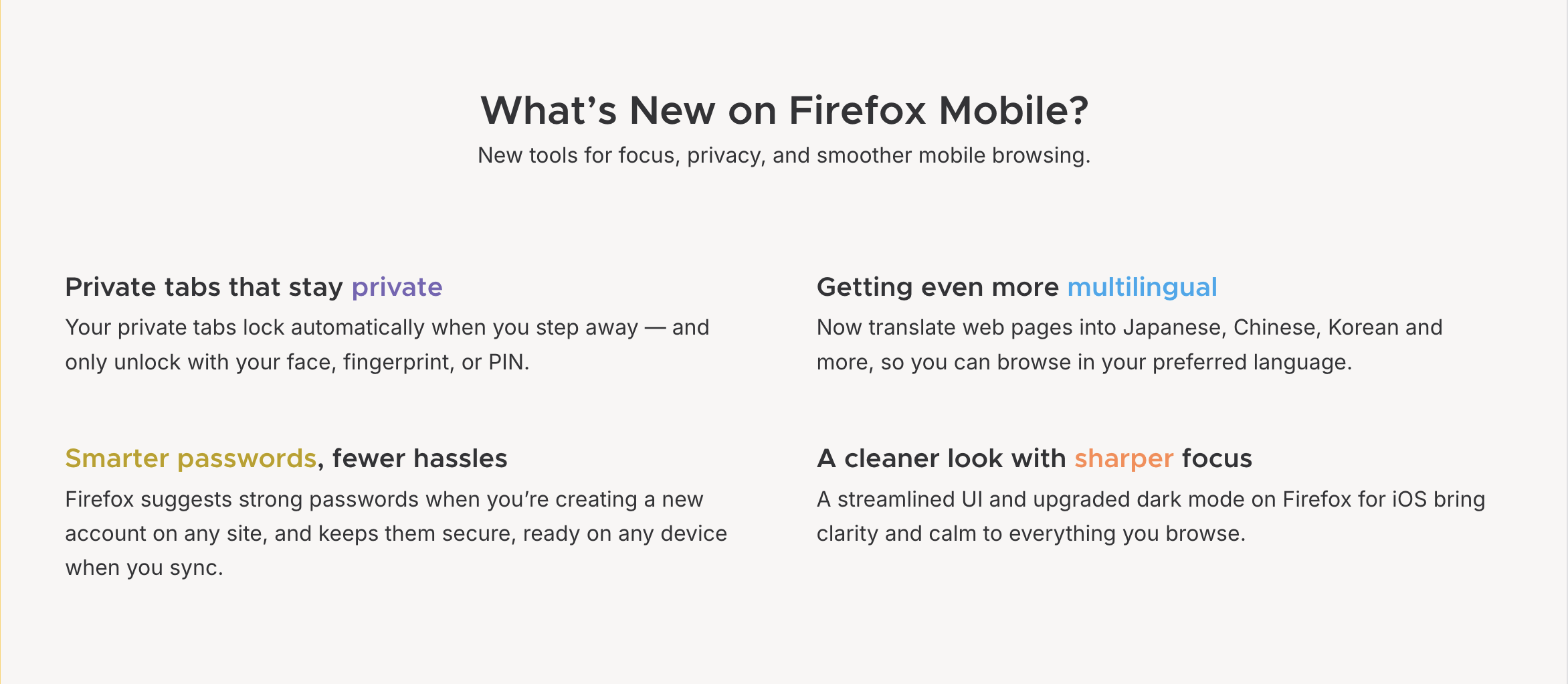
Imagine you’re making a landing page, or a changelog. You don’t have too many impressive things, so you sometimes rephrase something and put it the second time. Sometimes you can put unrelated items there. But if you do just that as a plain list, people would notice it easily, so you make each item a card. Additionally, you add bells and whistles and tags and ai-generated images. Here:


How plugins and themes relate to being a safe space for thoughts? I get it, those are important, just not under this heading. How is logseq sync better than icloud? Why does the picture say “syncing” but description says always up-to-date?
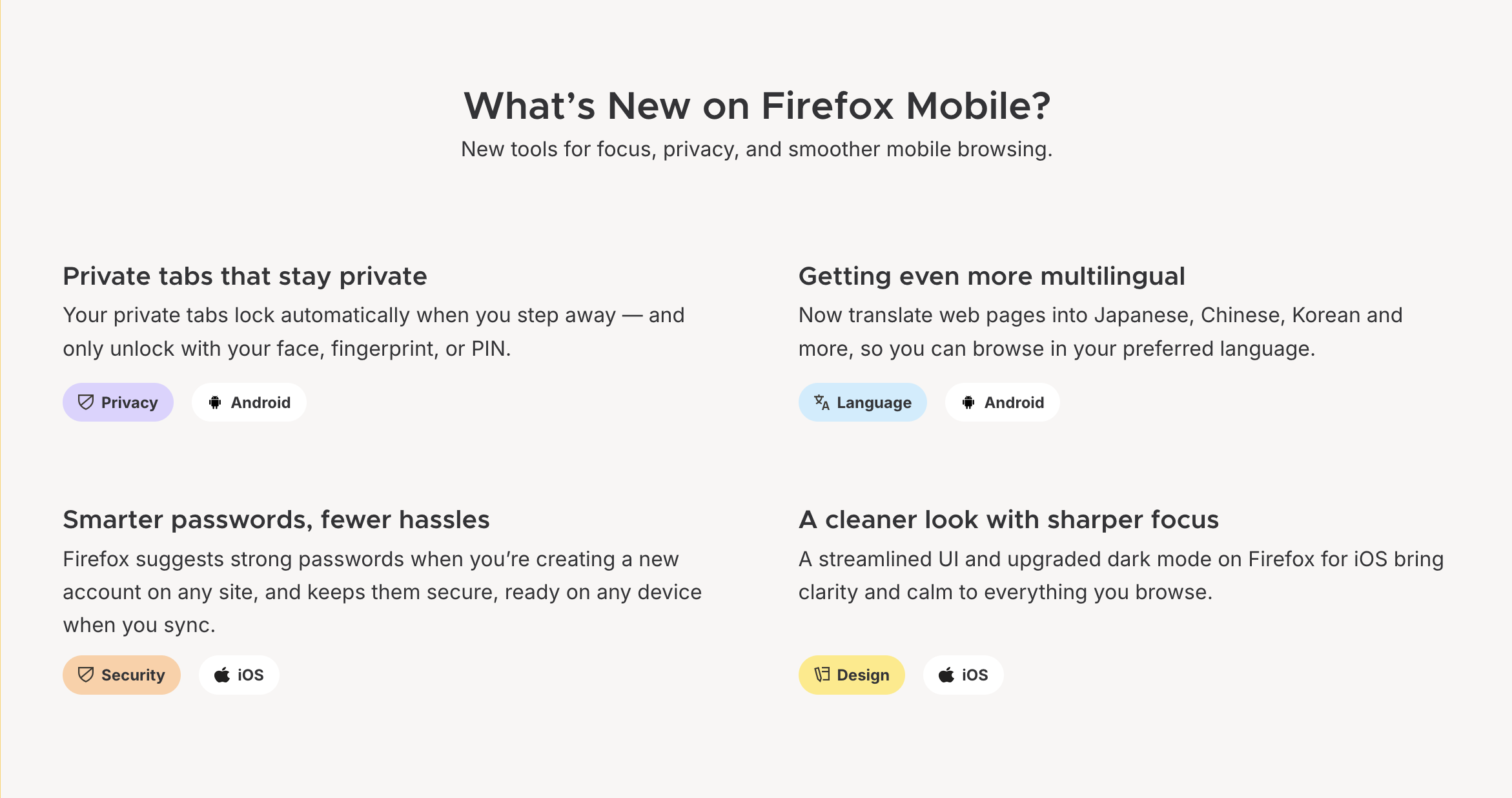
That’s all less noticeable when put into cards, but the healthier approach is to remove all the distraction, make a good skeleton, and expand that. Here is how bookov.app goes with being free and storing stuff on device:

It took quite amount of space, but it’s taken with text that is interesting to read, not with cards and empty words.
Cards let you ignore the proximity principle
Being the jocker of patterns, cards let you ignore the proximity principle inside them. I’ll put another screenshot but you can notice that on any of the screenshots above as well.
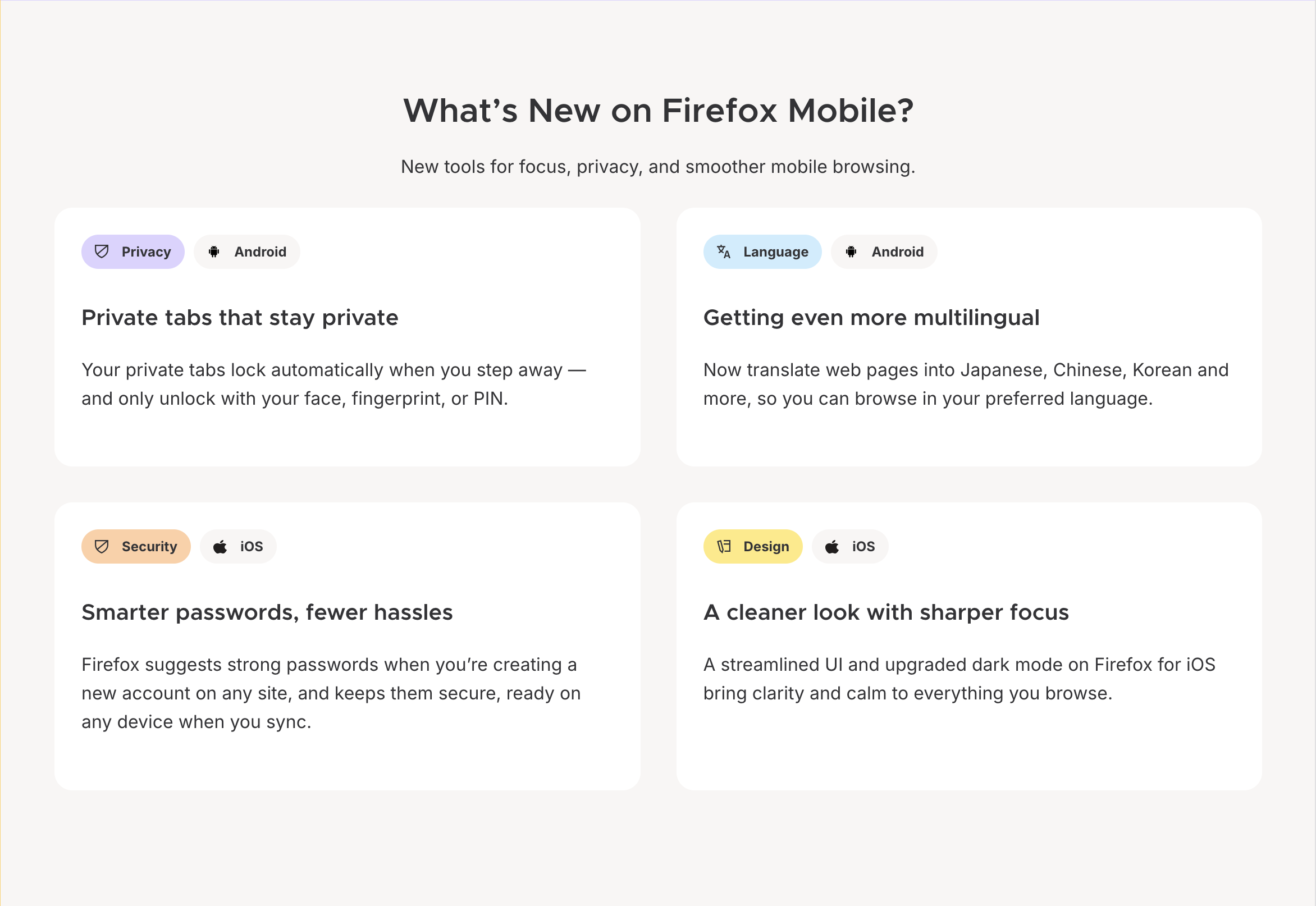
Space between tags and heading and heading and text is the same, and the same as space between cards. Subheading “new tools for focus…” is closer to the cards than to the heading. Inside the tag, space between icon and text is bigger than space between tags, and than tag padding.
If we put the spacing in order, it becomes obvious that tags are the most noticeable elements there, and that they don’t deserve it because they carry zero new information.
Cards add cognitive burden
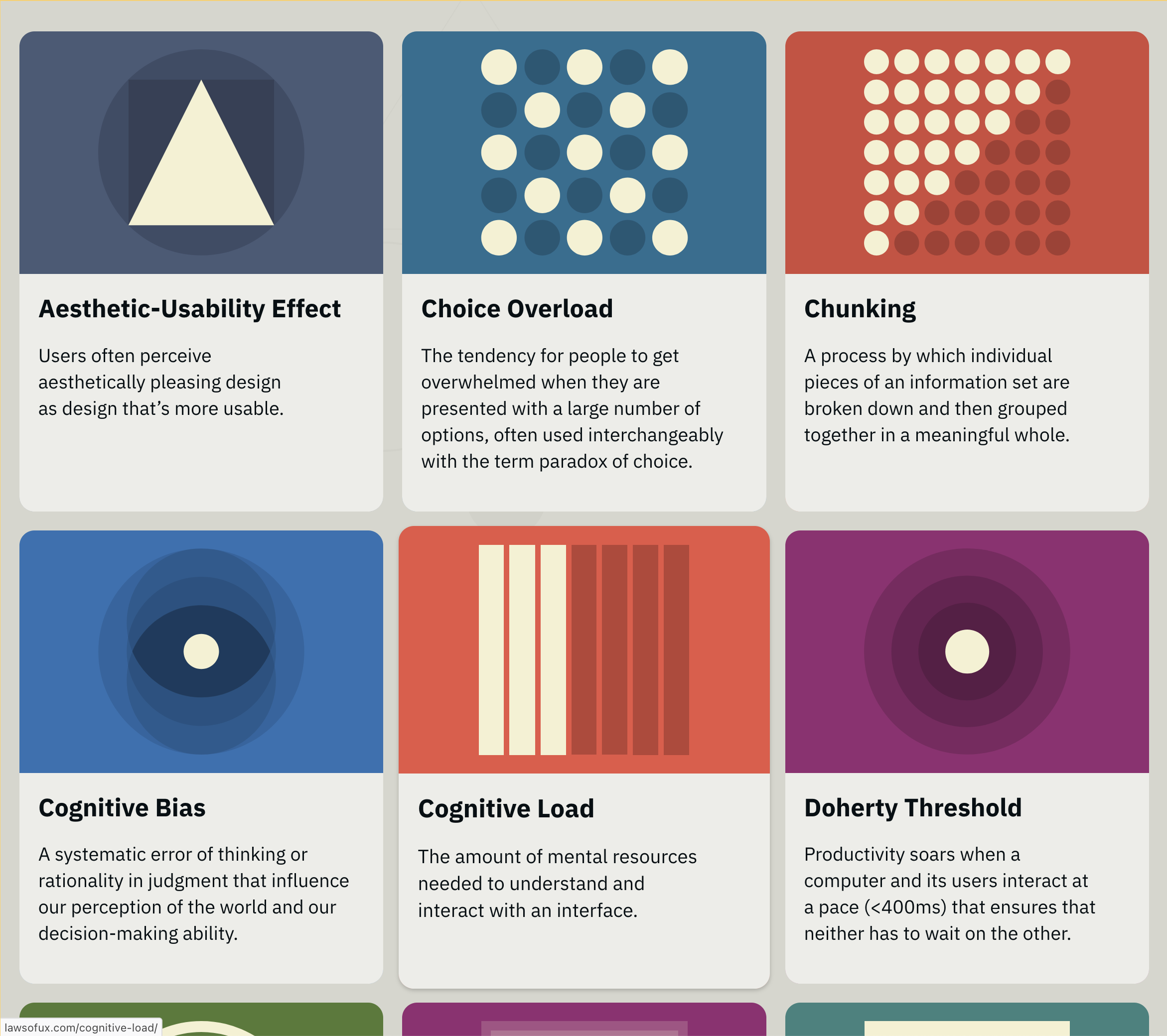
Cards enclose elements. This makes new elements, the cards themselves, and they make new relations between elements. Designers and developers need to pay more attention to compose them, and people who see the result need to perceive them all. Metaphorically, I need to dive into a card to see what’s inside. When we are in a grid of cards, I need to dive in and out instead of glancing through the grid. Look:
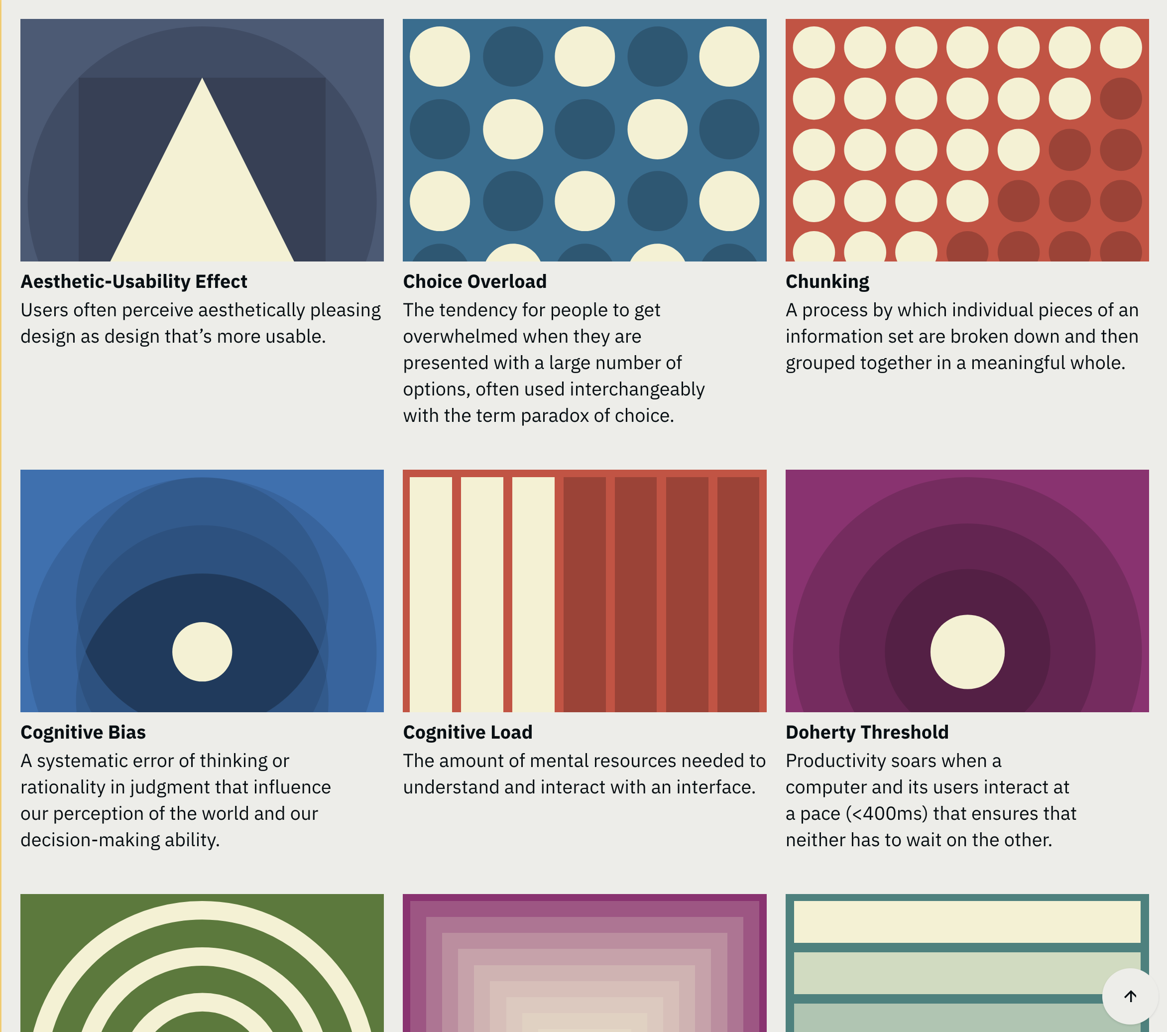
When we remove all the extra relations, skimming through headlines becomes easier even though they became smaller. It also allowed to scale the pictures. Some of them could be re-drawn for the format but there is no good reason to put them on cards without making them full width. And when we done that, it becomes apparent that some of the pictures are not really helpful in understanding the matter.
Sidenote: There is an idea of data-inc ratio, that is mainly applied to graphs, but IMO would perfectly fit here as well. The reason you shouldn’t waste even metaphorical inc is that brain has to perceive it. Bag of tricks with charts if you’re interested.
Where cards are appropriate
All that said, cards are a useful trick. The usefulness comes from the same traits that makes them unneeded in the cases above: they enclose elements, make them stand out, and require people to dive inside them.
Classic example is CTA. You already said what you had, and now need to summarise it and give people one clear direction from your page. Mine is as good as any:

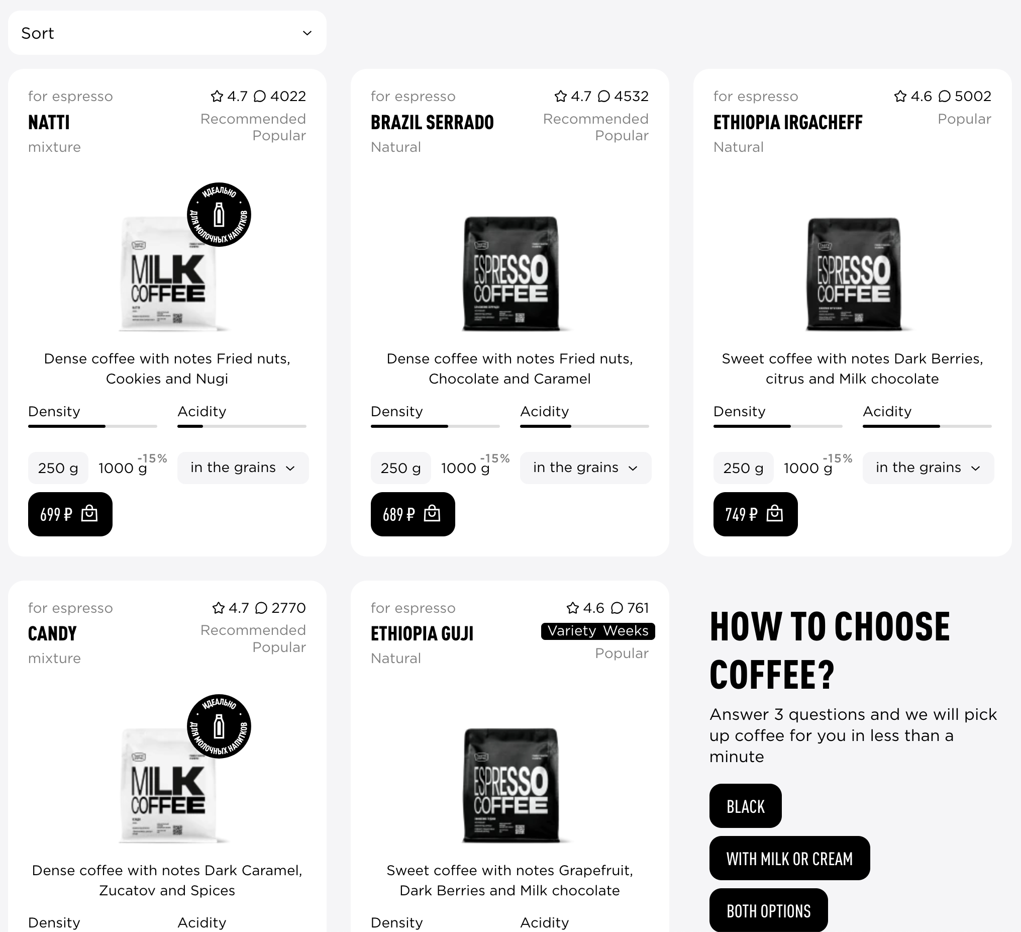
Another example could be when internal layout of the card is substantially complex and it’s hard to make the distinction using only spacing. Or when what’s inside the card could be a page itself, like a product card where you can choose between variations and add to cart.
Conclusion
For so many situations where cards are used, padding would be enough. Putting spacing into an order requires attention, but that’s a good one, where semi-automatic application of the proximity principle leads to better result every time.
The principle: Recursively, internal spacing should be no larger than external spacing.