TL;DR
gist.
Introduction
Firefox reader mode is a great idea. Most of the websites, including this one, are not as pleasant to read as gwern.net, and it’s fine. Writing a blog post doesn’t have to be a design exercise.
In reader mode, Firefox takes the content of the page and renders it in a different layout, supposedly better for reading. You can set up some of the things there, but there are edge cases when you can’t and it’s clearly broken.
Partly this is because reader mode is an impossible task. You normalize anything into a standard layout. While it’s mostly just a bunch of paragraphs and pictures, people sometimes get creative with code, quotes, tables and all sorts of custom layout.
That said, we can make some styles marginally better.
Fonts
Firefox doesn’t respect the browser’s default fonts. But you can force it to.
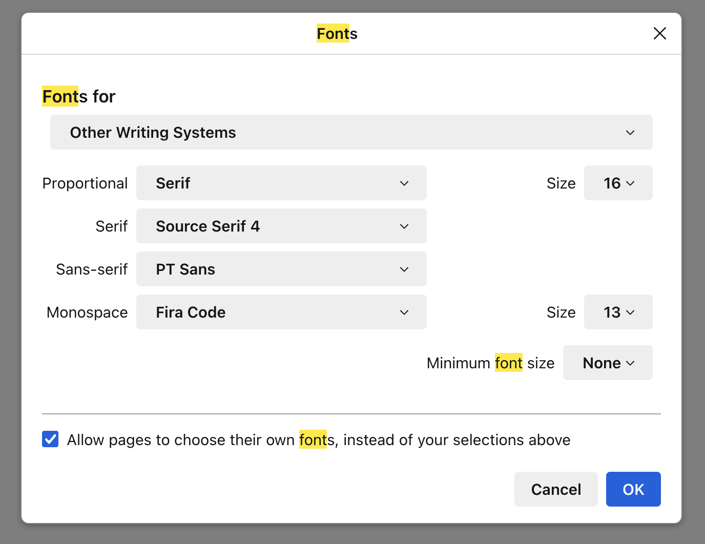

First of, you need to allow custom css.
- Open about:support in the address bar
- Find “Profile Folder” there, open the folder
- Create chrome/userContent.css file there – this will be the place to add custom css
- Open about:config
- Enable
toolkit.legacyUserProfileCustomizations.stylesheets - Reload the browser
You’ll need to reload the browser every time you change your custom css.
This custom css is applied to every web page, so we’ll need a selector for just the reader more. Conveniently, reader mode wraps articles into .moz-reader-content.
So, fonts.
.moz-reader-content { font-family: serif; }
This will use the serif font from the settings. Tada.
Blockquotes
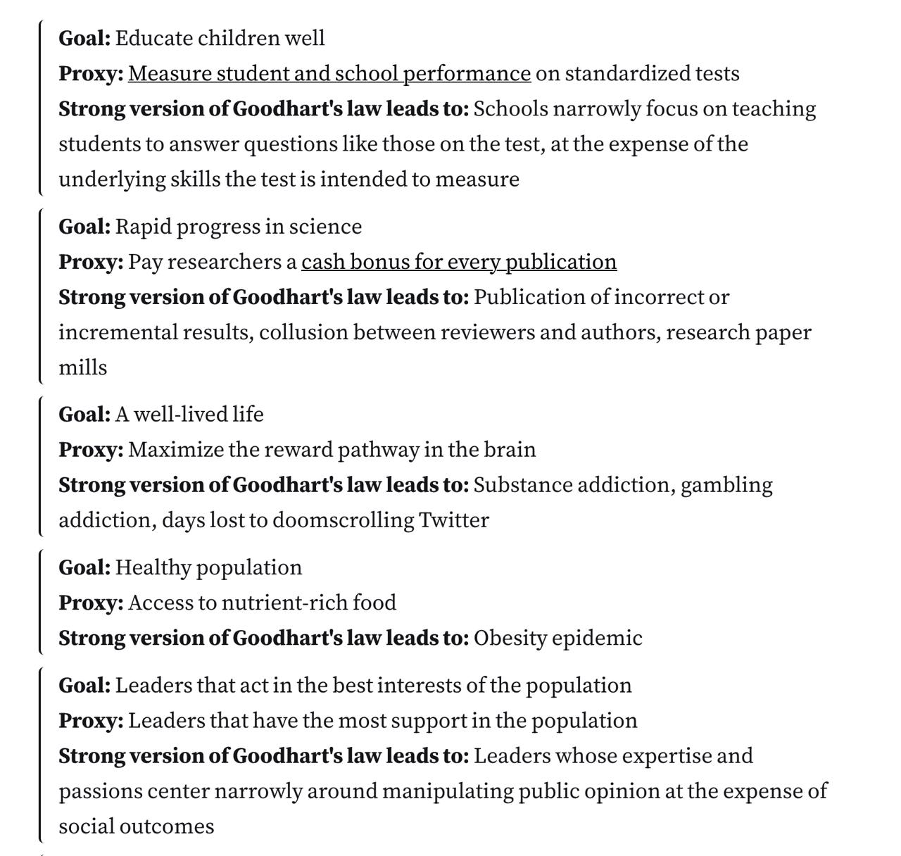
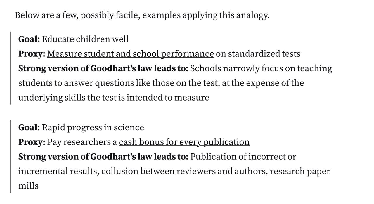
By default they are weirdly rounded, and if two of them are put next to each other, they look too close.
.moz-reader-content blockquote {
  border-radius: 0 !important;
  border-inline-start-color: #717275 !important;
}

.moz-reader-content blockquote + blockquote {
  margin-top: calc(8px + var(--line-height) * 0.8) !important;
}
Code Blocks
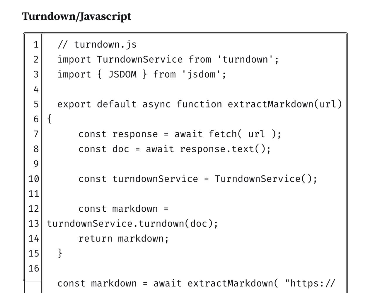
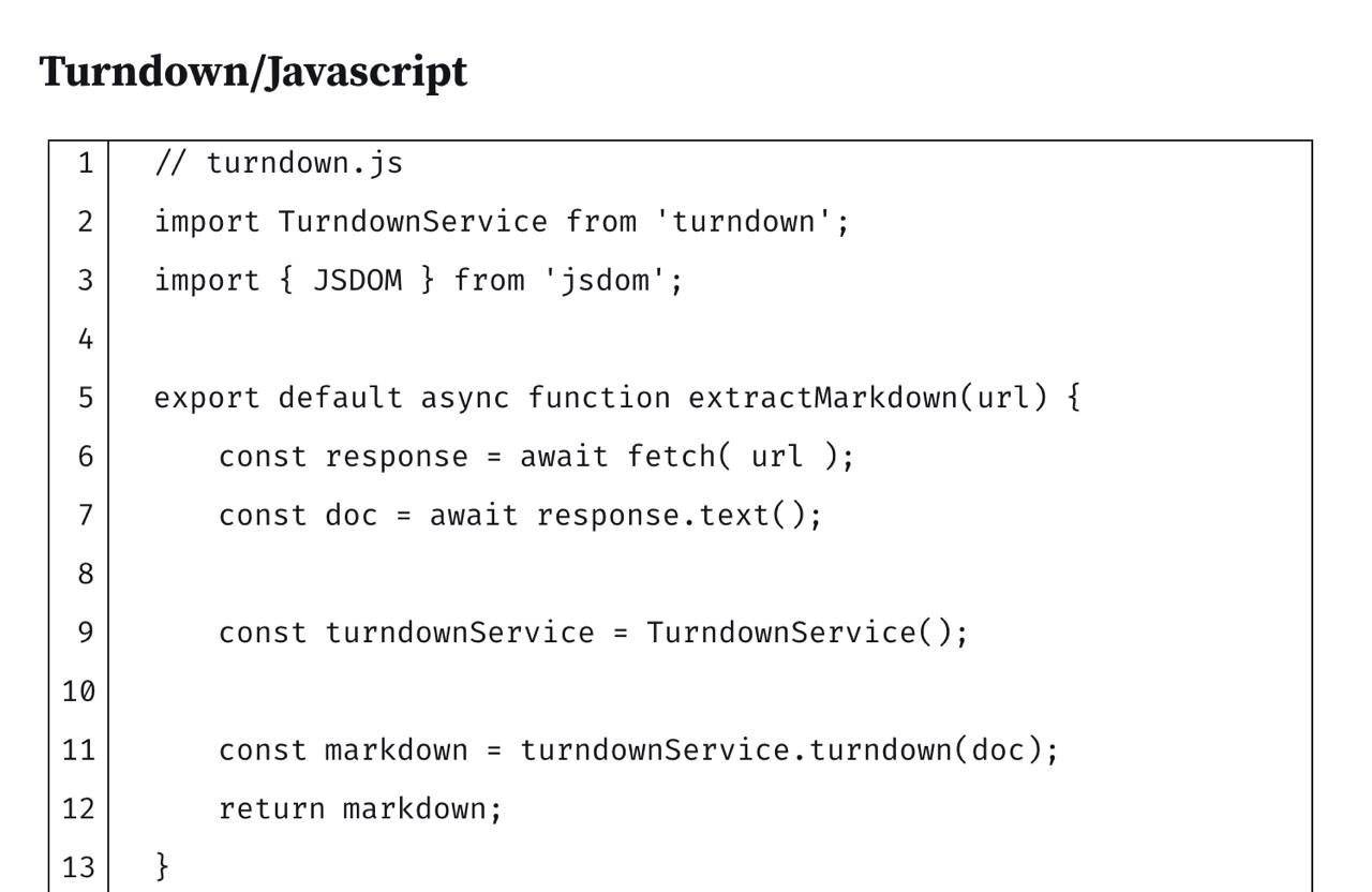
Some people can’t just use <code> and call it a day, so there are all sorts of wrappers that sometimes make DOM structures like table > tr + tr > div > pre > code. I probably can’t fix all of them but I can fix what I meet. So far the snippet is
.moz-reader-content pre code {
  border: none !important;
  padding-top: 0 !important;
  padding-bottom: 0 !important;
  margin-bottom: 0 !important;
  font-size: 16px;
}

/* sometimes it puts code into tables :shrug: */
.moz-reader-content table pre {
  margin: 0 !important;
  display: table-cell;
  padding: 0 !important;
}

/* p inside table almost definitely means code */
.moz-reader-content td div {
  display: contents;
}
.moz-reader-content td p {
  margin-bottom: 0 !important;
  padding-top: 0 !important;
  padding-bottom: 0 !important;
  line-height: 2;
}
Still not ideal, but better than before.
Selection Color
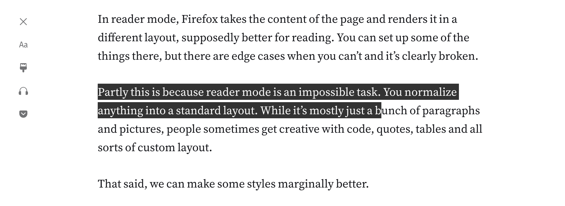
That’s a nasty nitpick, but I find it looking much nicer this way:
::selection {
  background-color: #333333 !important;
  color: white !important;
}
Note that .moz-reader-content is not used here, so it’s applied everywhere.
Conclusion
The code is on GitHub. If you know how to make it a pull request somewhere let me know.
UPD: Firefox has a contributors guide, but basically you need to clone the repo and make a PR but every tool they use is special and breaks on every step, but not hopelessly and I managed to make a PR for the fonts part. If it works I’ll try and turn the other bits into PRs too. Should be easy for blockquotes and significantly more work (probably in the readability repo) for the code.
UPD2: My pr is merged!